Today’s user experience design case study, kids, is this painful screen from leading Windows utility Hard Disk Sentinel version 6.30. This is how NOT to design an interface in your app or application when you could’ve made your tool easy and intuitive, people. Danger danger.
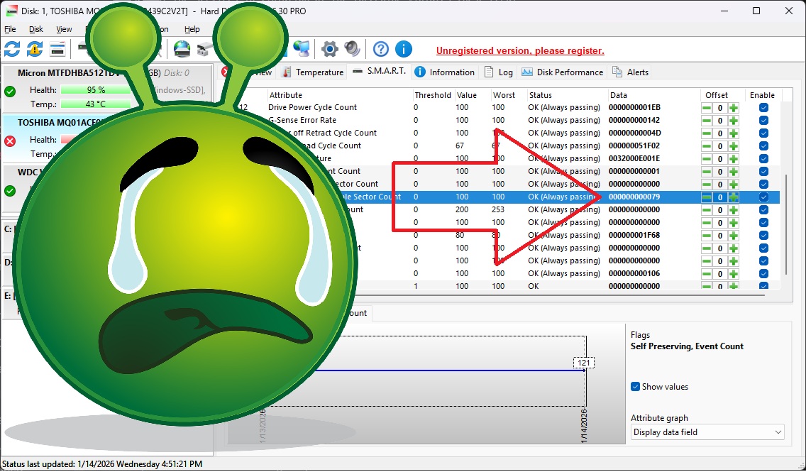
Now we all love looking at SMART data need to check out our hard drives periodically to make sure they’re not about to freak out and spray our precious data into oblivion. SMART is a useful standard to show you how close your dodgy hard drive is to spinning off to that great recycle bin in the sky (cloud?). In Hard Disk Sentinel, this is the user experience when you click to see SMART data for your drive.
What’s the User Experience Design Fail?
In this case, I’m most interested in the “off-line uncorrectable sector count,” aka spots where the drive is physically unreadable. Here, the app is showing me that data. Kinda. Can you find the count of bad sectors?
Is it 198? Is it the threshold? Value seems like a good guess, but it’s an even 100, so… unlikely? How about Worst? (How about Worst User Experience Design Case Study Fail? Is there a Best? Guess not.) Surely it’s not DATA, aka 0000000000079, right?
Design Case Study Spoiler: It’s Data
Yep. The user experience “design” pros who built this app know their tech, but they obviously have never met a user. Because the key piece of info on this line is presented by default in hexadecimal, which may be the lingua franca for programmers and savants, but is gibberish to normal users. The real number of bad sectors is… 121, which is what 00000000000000000079 means in normal base-10 notation, which you and I call “numbers.” When I found this out I had to laugh at the sheer audacity. Literally decades of hard work developing and maintaining this product (since 2005) and they have never thought to put this info in NUMBERS.
Are They User Experience Design Pros?
Is it fair of us to slam these guys for this user experience gaffe? I mean, it might be just one guy. And as we found, they’re in Hungary. I mean, in Hungary, street signs and accounting are all done in hexadecimal base-10 numerals. And this product has only been in production for a little while 20+ years!
But yeah, sarcasm aside, this product ain’t exactly Adobe Photoshop.
User Experience Design Caveats
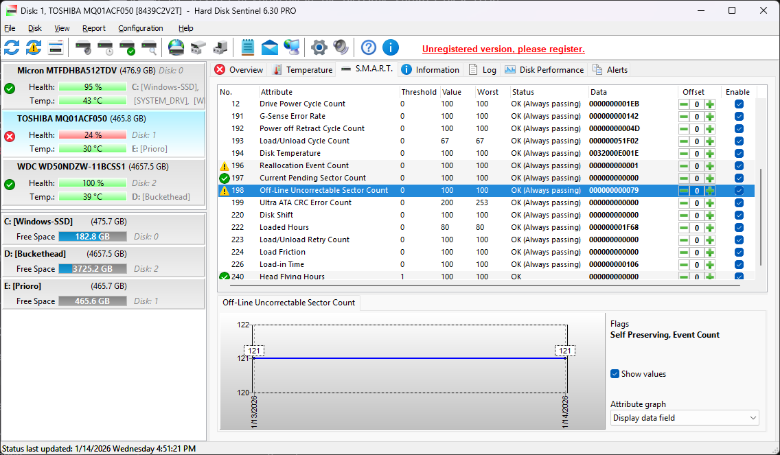
To be fair, the 121 is presented in the line graph at the bottom of the screen. You saw that, right? I mean, why would you look at any of that other information… all those columns… when you could look at the graph? And of course you knew that 121 was the base-10 translation of the number in hex, right? I mean, obvio.
And of course, there is a way to change the presentation of the “Data” column to base-10. You merely have to right-click on that column (but NOT on the column header, nooo, that would be too intuitive) and choose the option “Decimal data fields”.
But that’s obviously NOT the default, because why would you want your data in numbers when you could have them in machine-ready hexadecimal?
